Signed in as:
filler@godaddy.com

I led the brand, marketing and communications work behind Bird & Bird’s refreshed brand strategy, visual identity, website and employer brand. I drove the strategy and creative direction, working with internal teams and specialist agencies to bring the work to life across identity, tone of voice, digital, templates and talent communications. The aim was simple: make the firm’s difference easier to see, use and believe.
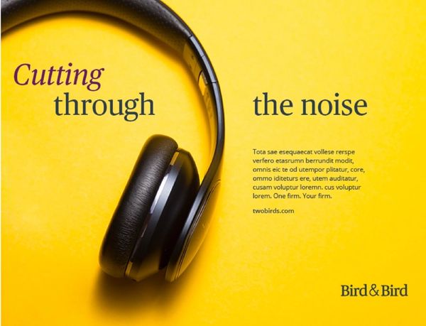
Bird & Bird had strong ingredients: an international platform, a sector focus, a genuine technology story and a collaborative one-firm culture.
But the brand needed a stronger centre of gravity and a more distinctive visual presence.
The original brief was for a new website, with visual identity considered as part of that work. My view was that the firm needed to step back first. A new digital experience would only work if it was built on a clearer brand strategy and a visual style strong enough to set the firm apart.
That visual style also had to work across a complex international partnership, flexing for different markets, channels, audiences and levels of sophistication. This could not just be a look and feel for the website. It needed to become a full brand design system: distinctive enough for high-impact campaigns and digital experiences, but practical enough for pitch decks, templates, social media, events and everyday communications.
Without that, the risk was obvious: a better-looking website, but still no shared story holding the firm together, and no visual language strong enough to make the brand memorable.
I developed a strategic framework centred on To make it possible, supported by the client-facing line One firm. Your firm. The brand personality – curious, bright, practical and likeable – became both the strategic filter and the creative brief for how the firm should look, sound and behave.
The visual style was a big part of the answer, not an afterthought. I wanted Bird & Bird to feel brighter, fresher and more distinctive than the usual law firm world, but still credible enough for an international legal brand. Too safe, and the firm would disappear into the category. Too playful, and it would lose authority.
We moved the identity into a lighter, more confident and more recognisable place: a fresher colour palette, focused and real imagery, stronger use of space, and distinctive assets such as the ampersand and Curiosity Line. Those assets gave the brand movement, flexibility and a visual signature beyond the logo.
I also developed and codified a new tone of voice to work alongside it, moving the firm towards language that was more client-centred, direct and human, without losing authority.
The result was a brand system with a clearer strategy and a much stronger creative feel. It helped Bird & Bird show up as one firm: not by forcing sameness, but by giving people a shared idea and a distinctive visual language to work from.

The website had to be more than a new front door for the firm. It needed to help clients, candidates and colleagues understand what Bird & Bird stood for, find the right expertise quickly and feel the difference in the brand as they moved through the site.
The previous website had become uneven. Some areas were working harder than others, user journeys were not always clear, and important content was not always doing the job it should. The site also needed to do more to showcase the firm’s strongest specialisms and support the market position we had defined.
I led the strategic and creative direction for the website, working with UX, design and technical specialists to translate the new brand into a digital experience. My role was to make sure the site was not simply redesigned around the firm’s existing structure, but rethought around the audiences it needed to serve and the story it needed to tell.
The work focused on two ideas: evidence and engagement.
Evidence meant showing the substance behind the brand: the sectors, expertise, people, client issues and proof points that made Bird & Bird credible.
Engagement meant making the experience easier, more useful and more distinctive. Not a law firm filing cabinet. Not a static set of pages with a brighter homepage. A site that helped people move through the firm’s world with more interest and less friction.
The process drew on leadership input, client insight, employee research and persona-led UX thinking. We tested how the refreshed brand could work across the homepage, sector and practice content, careers pages, people profiles, insight pages and the corporate story.
The creative challenge was to push the site out of the usual law firm comfort zone while keeping it useful. The brand strategy gave us permission to be more distinctive: curious, bright, practical and likeable. But the site still had to do the basics brilliantly. Navigation had to be simple. Content had to be findable. The experience had to work for people arriving with a specific problem and very little patience.
After launch, the site became a platform for ongoing improvement, with work continuing around Sitecore, analytics, search, navigation, personalisation, content performance and integration with tools such as Passle.
The performance evidence was strong: organic site visits increased by 126% year on year, the site gained 19 new Google top-three positions for target terms, and there were 38 persona pattern matches for personalisation.
The site also received external recognition. In Living Group’s 2025 rankings, Bird & Bird returned to the top five and ranked No. 3. The review praised the site’s distinctive visual identity, consistent brand-driven tone of voice, strong insights experience and one of the best About pages in the sector.
That mattered because it showed the brand was not just working in theory. It was visible in the experience, measurable in performance and distinctive in the market.
Bird & Bird had a strong culture, but it needed a sharper talent story.
People knew the firm was collaborative, collegiate and good to work with. Clients felt it too. But those qualities had not been captured in a way that was distinctive enough, or useful enough, for recruitment, retention and internal engagement.
That is a familiar problem in Professional Services. Culture is often one of the most valuable things a firm has, but it gets described in the least ownable way: supportive, ambitious, inclusive, friendly. All true. Also true of most competitors.
The employer brand needed to go further. It had to explain why lawyers, would-be lawyers and business professionals should join and stay at Bird & Bird. It also had to connect directly to the main brand, rather than sit beside it as a separate recruitment campaign.
I led the project with the core team, using research to get beneath the usual language. The work included more than 35 senior stakeholder interviews, more than 15 focus groups with colleagues around the world, and testing with colleagues and recruitment agency partners. That gave us a proper evidence base, but also a sharper sense of what made the culture distinctive.
The EVP was organised around four parts of the colleague experience: brand, culture, development and benefits.
The more distinctive work was the DNA.
We wanted to capture what Bird & Bird felt like at its best: not generic values, not internal wallpaper, but the common thread running through the firm.
The DNA became:
Truly collegiate. Super curious. Big on trust. Full of respect. Always evolving.
Those phrases worked because they were specific enough to feel ownable, but flexible enough to stretch across countries, roles and levels of seniority.
The employer brand idea was A world of possible.
It connected directly to the firmwide purpose, To make it possible, but translated it for a talent audience. It captured the promise of working on ambitious international matters, being trusted early, feeling supported, growing your career and still being able to be yourself.
That balance mattered. Strong employer brands do not just say, ‘Look how impressive we are.’ They answer the quieter candidate question: ‘Can I see myself here?’
We created a full toolkit, not just a line: EVP narrative, DNA framework, launch film direction, design elements, copy examples, advertising, posters, email signatures, social media, merchandise, roller banners and guidance for bringing the DNA into team meetings, office environments, onboarding and colleague communications.
The point was to make the employer brand usable. A good idea is not enough if no one knows what to do with it.
This project sits where brand, culture and talent meet. It shows how I use research and creative judgement to make an organisation’s culture more visible, more distinctive and more useful.