Signed in as:
filler@godaddy.com

I joined TTP at a point when its brand was not doing the business justice. The firm was highly innovative and deeply collaborative, but lacked a clear centre of gravity, both strategically and visually. My challenge was to build a more coherent brand system, website and marketing approach that could help the firm stand out, explain itself more clearly and support growth.
TTP is a difficult business to explain, which is exactly why the brand mattered.
The firm works at the intersection of science, engineering, product development and technology consultancy. Its work is highly specialist, often confidential, and rooted in deep technical expertise. But the brand did not fully reflect the sophistication, ambition or commercial relevance of the business.
The immediate need was a new website. But the website was not the whole problem. TTP needed a clearer strategic story, a more distinctive visual identity system and a stronger platform across marketing, business development and client-facing materials.
I developed the brand positioning of ‘Redefine possible’.
The aim was not to simplify TTP. It was to make its complexity easier to navigate, easier to value and easier to take to market.
I led a series of strategy and implementation projects to give TTP a clearer and more sophisticated brand.
That meant strengthening the positioning, developing a more distinctive visual system, improving the photography and creating more coherent marketing assets. It also meant delivering a website that behaved like a proper marketing platform, not just a digital brochure.
The important shift was not just that the business looked better. It became easier to explain, easier to market and easier to present with confidence.
That is where brand creates value in a complex, expert-led consultancy: not by simplifying the expertise, but by giving it a clearer commercial position.


TTP had created a new logo in 2019, and there was a clear desire at board level to keep it. That made commercial sense. The logo was already in use, and changing it again would have created unnecessary cost and disruption.
The problem was that the logo was hard to read and there was very little around it by way of visual style. It needed support.
So the challenge was not to start again. It was to build a brand identity system that worked with the existing logo, strengthened it and gave the business a more distinctive visual presence.
We developed a new visual style built from a three-dimensional interpretation of the logo, creating a stronger sense of depth and perspective. Combined with a new colour palette, transparencies and overlapping shapes, it gave TTP a more sophisticated and ownable visual language.
The system then had to work across the full marketing ecosystem: product photography, presentations, proposals, social media, campaign assets, content, events and everyday communications.
That mattered because TTP’s brand could not only exist in high-profile moments. It needed to work in the places where technical consultancies actually sell: pitch decks, case studies, sector campaigns, proposals and expert-led content.
The result was a visual identity system that made the brand feel more intelligent, inventive and commercially credible, while still allowing enough flexibility for very different markets and audiences.
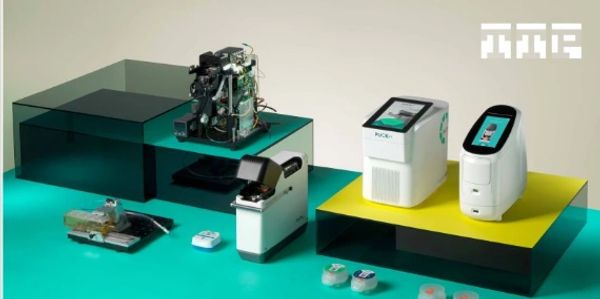
Product photography was a particularly important part of the shift.
TTP’s work is often complex, technical or confidential. That makes it hard to show. The photography needed to create interest and credibility without exposing sensitive detail or falling back on generic technology imagery.
We developed a new approach that made the work feel more tangible, precise and distinctive. The focus was on engineered objects, materials, prototypes, devices and details: the real evidence of innovation.
That gave the brand a stronger visual connection to the craft and intelligence behind the consultancy. It also helped avoid the usual innovation clichés: glowing circuits, abstract gradients and anonymous lab shots.
The same principle shaped the wider asset system. The brand needed enough structure to create consistency, but enough flexibility to work across deep tech, health tech, life sciences, autonomous technology and specialist R&D.
A campaign for life sciences could not feel identical to one for autonomous technology. But both still needed to feel unmistakably TTP.
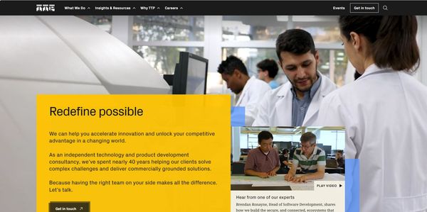
TTP’s previous site was only a few years old, but the business had already outgrown it. The marketing team needed a site that was easier to manage, stronger visually, better for content marketing, more measurable and more capable of supporting future growth.
I led the website strategy and creative direction, making sure the site was shaped by the new brand system rather than simply becoming a better-looking version of what already existed.
The site had to make TTP easier to understand for people who did not already know the business. It had to help specialist audiences find relevant expertise without drowning them in technical detail. It also had to give the marketing team more control and clearer performance insight.
The work took a phased approach: an interim WordPress homepage and module refresh, followed by a fuller audit, discovery workshop, audience personas, UX review and competitor research. The full redesign then moved the site to Webflow, creating a more flexible platform for content, search and ongoing optimisation.
All proof that the site became healthier, more usable and better placed to support growth.